DAVID'S DISPOSABLES: MY PHOTOS
- Millie Stephens
- Mar 4, 2021
- 2 min read

Updated: May 5, 2021
So after researching a bit about the app I decided to take some photos of my own on there and see how they turned out. Most of these photos were taken at similar times to my first two disposable shoots so that'll be interesting to compare their outcomes.


I'm really not pleased with how these photos turned out. These first four appear really dark with very harsh contrasts which is something that I don't like in terms of aesthetics. I don't think they look like disposable images per-say as they are a lot more blue/cool toned then warmer which is what I experienced with the two disposable shoots that I have already done. However these blue tones may be because of the lighting, I was facing the light instead of having in behind me in a lot of these shots.

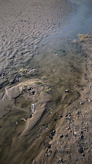


I prefer these next images more as they appear more warmer toned, probably due to my positioning in terms of the light source (the sun). However they do still appear very contrasty and have a high clarity which isn't often seen in disposable and analogue photography- usually that is what is missing, clarity. I like the pop of blue in the second image but the over saturation of colour makes it appear very false and the image looks almost plastic. I prefer the tones used in the last photo which I used a flash on, the colour of the sky blends nicer and even though the tones are very dark still, they seem to look more realistic then the over saturation of the second image here.
Editing to Look More 'Disposable'
Because I don't think these photos emulate the disposable/analogue style I will some into Lightroom and see if I can replicate it there. This will be difficult as the size of these files will be very small and I don't want to ruin the quality and add too much noise, however this is often an aspect of disposable imagery.


To edit these photographs I increased the exposure, contrast and highlights. As well as slightly bringing the shadows up, and pulling down the whites and blacks. I also changed the white balance of both photos making them warmer and tinted them slightly green. I slightly increased the saturation as well.
I think edited photos to look more disposable would work with images of people better than landscape photos which is why my next shoot will be digital and I will digitally manipulate my photos to make them look 'vintage'. I'll use a combination of photo filters, apps, and popular Lightroom techniques to create the desired look.


Comments